Form
The Form widget simplifies the process of creating custom forms on your WordPress website. With this widget, you can easily set up contact forms, registration forms, or any other type of form you need.
Content Tab
Form Fields
- Content
- Name Field
- Type: Select "Text" as the type for a standard text input field.
- Label: Enter "Name" as the label; this will be displayed above or next to the field.
- Placeholder: Input "Name" as the placeholder text, which will appear inside the field before the user types anything.
- Required: Toggle to "Yes" if you want to make this field mandatory to fill out.
- Email Field
- Follow similar steps as the "Name" field, ensuring that the type is set to "Email" to validate email addresses entered by users.
- Message Field
- Set the type to "Textarea" to allow for multi-line input, suitable for messages.
- Adding Custom Fields
- Click on "+ Add Item" to create additional fields.
- For each field, you can select the type from options like Text, Email, Select, Textarea, and more.
- Name Field
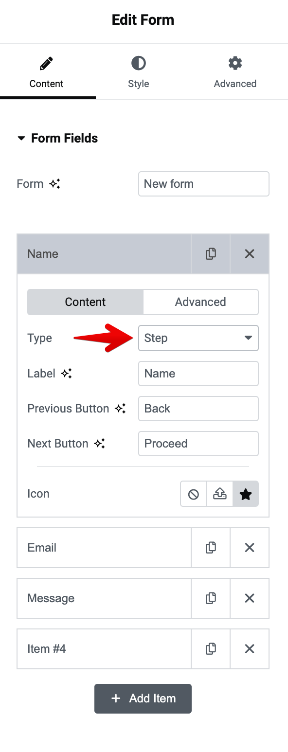
Adding a new step
To add a new step to your forms, simply add a new item and from Type menu, select Step. Now any fields that you add after 'Step' will be added in a new section. View a live demo of multi-step forms.
- Advanced
- ID: Ensure each field has a unique ID for identification.
- Default Value: Set a pre-defined value if needed.
- Shortcode: Use the generated shortcode to place the form field elsewhere.
Buttons
- Text: Input "Send" or another call-to-action for the submit button.
- Submit Button Icon: Choose an icon to display on the submit button if needed.
- Column Width: Set to "100%" to span the full width of the form container.
Settings
- Label: Toggle "Show" or "Hide" to display or hide labels for your form fields.
- Required Mark: Toggle "Show" or "Hide" to display or hide required labels.
- Add Action: Add actions that will be performed after a visitor submits the form (e.g. Send an email notification, Connect to a third-party such as MailChimp, Redirect, etc.)
Actions
- Some common actions include:
- Email the form results to an email addresses.
- Redirect the user to a “Thank You” page.
- Add subscriber information to a newsletter autoresponder service.
- Add user information to a CRM.
- Send form data to a Slack or Discord Channel.
- Open or close a popup.
Selecting an action will add a new tab that contains settings related to the recently added action.
Actions that are related to third-party services require a successful integration with JupiterX to work properly. You can integrate third-party tools with JupiterX by going to WordPress dashboard > Elementor > Settings > Jupiter X
Steps Settings
- Type and Shape
- Select the type of steps indicator if your form is multi-step, such as "Number", "Icon", etc.
- Choose the shape for the step indicators, like "Circle", "Square", or "None".
Feedback Messages
- Custom Messages: Enable this option to set custom messages upon form actions.
- Define the "Success Message" that will appear when the form is submitted correctly.
- Write an "Error Message" for when the submission fails due to an error.
- Specify a "Required Message" for when required fields are left blank.
- Input a custom message for "Subscriber Already Exists" if applicable to your form use case.
Style Tab
General
- Column Spacing: Adjust the space between columns. Slide the bar or input a value to set the spacing (measured in pixels).
- Row Spacing: Configure the space between rows in the same manner as column spacing.
Label
- Color: Choose a color for the text of the labels.
- Typography: Set the font properties for the labels, including font family, size, weight, transform, style, decoration, line-height, and letter spacing.
- Spacing: Adjust the margin around the labels to increase or decrease the space around them. You can set individual values for top, right, bottom, and left margins.
Field
- Background Color: Select a color for the background of the input fields.
- Border Type: Choose from various border styles such as solid, dashed, dotted, etc., for the input fields.
- Border Radius: Control the roundness of the field corners.
- Box Shadow: Apply a shadow effect to the fields if desired.
- Placeholder:
- Color: Set a color for the placeholder text within the fields.
- Typography: Customize the font properties of the placeholder text.
- Value:
- Color: Choose a color for the text that users enter.
- Typography: Define the font properties for the text input by the user.
- Padding: Adjust the padding inside the fields to increase or decrease the space inside them. This can be set for top, right, bottom, and left individually.
Select
- Icon: An icon can be selected to indicate a dropdown field.
- Color: Define the color of the dropdown icon.
- Size: Set the size of the dropdown icon.
- Vertical Offset: Adjust the vertical position of the icon.
- Horizontal Offset: Adjust the horizontal position of the icon.
Checkbox
- Size: Determine the size of the checkbox.
- Color: Choose the color for the checkbox itself or the checkmark.
- Typography: Set the font properties for the text next to the checkbox.
- Spacing Between: Adjust the space between individual checkboxes.
- Spacing: Control the margin around the checkbox group.
For checkboxes, additional options like background color, border type, box shadow, and border radius will be available to style the checkbox elements when they are in their normal state or when checked.
Radio
Radio buttons have similar styling options as checkboxes, including size, color, typography, spacing between individual buttons, and spacing around the radio group. You can also customize their appearance when selected.
Buttons
For form submission buttons, you can style:
- Width: Set the width of the button relative to its container.
- Height: Determine the button's height.
- Spacing: Control the margin around the button.
- Alignment: Choose the alignment of the button within the form.
- Typography: Customize the text appearance on the button.
- Color: Change the text color for different states such as normal and hover.
- Background: Customize the button's background color for different states.
- Border: Define the border style, width, color, and radius.
- Box Shadow: Optionally add a shadow effect to the button.
Messages
For feedback messages that appear after form submission, such as success or error notifications, you can set:
- Typography: Define the font properties for the message text.
- Success Message Color: Set a color for success messages.
- Error Message Color: Set a color for error messages.
- Inline Message Color: Choose a color for inline validation messages.
Steps
If your form is multi-step, you can style the steps indicator:
- Typography: Adjust the typography settings for the step numbers or titles.
- Spacing: Set the space between the steps.
- Padding: Adjust the padding inside the step indicators.
- Primary Color: Choose a color for the current step indicator.
- Secondary Color: Select a color for completed or inactive steps.
- Divider Color: If there are dividers between steps, select a color for them.
- Divider Width: Choose the thickness of the dividers.
- Divider Gap: Set the spacing between the dividers and the step indicators.