WooCommerce Shopping Cart
Creating a seamless shopping experience on your online store is essential for customer satisfaction. With JupiterX, you can enhance your website's shopping cart feature using the WooCommerce Shopping Cart widget. This widget allows customers to easily view and edit their cart from any page on your site. Here's how to add and customize it:
Step 1: Adding the Shopping Cart Widget
- Begin by navigating to the header template in the Elementor editor where you wish to add the shopping cart.
- In the Elementor panel, search for the "Shopping Cart" widget.
- Once found, drag the widget to a suitable location in the header.

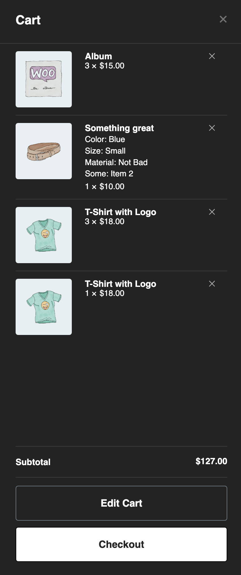
Step 2: Configuring the Shopping Cart Content
- Choose Icon: Select a cart icon that aligns with your website's aesthetic from the dropdown menu.
- Default Skin: Pick a skin for the icon. Available options include 'Light', 'Dark', or other styles compatible with your site's theme.
- Cart Quick View: Enable this to let users see a cart summary by activating the 'Yes' toggle.
- Enable Ajax: Activate 'Yes' to update the cart dynamically without page reloads.
- Thumbnail: If you want to display product thumbnails in the quick view, toggle 'Show'.
- View Cart Button: Toggle 'Show' to add a button that directs users to the cart page from the quick view.
Step 3: Customizing Texts
- For the 'View Cart' button, provide the text label you'd prefer.
- Set a heading for the quick view panel, like 'Your Cart', in the Quick View Heading field.
Step 4: Styling the Shopping Cart
- Icon:
- Set the cart icon's size using the slider.
- Adjust padding to space the icon inside its container properly.
- Select the cart icon's alignment (left, center, right).
- Define the icon color for both normal and hover states.
- Optional: Set a background color for the icon.
- Customize the cart icon's border type, radius, and box shadow.
- Number:
- Typography
- Click on the "Typography" option.
- A pop-up with typography settings will appear, allowing you to adjust the following:
- Family: Choose a font family from the dropdown list.
- Size: Set the size of the font by typing a value or using the slider.
- Weight: Select the weight (thickness) of the font, ranging from thin to bold.
- Transform: Choose from uppercase, lowercase, capitalize, or normal text transformations.
- Style: Select normal, italic, or oblique font styles.
- Decoration: Choose underline, overline, line-through, or none for text-decoration.
- Line-Height: Adjust the height of a line by typing a value or using the slider.
- Letter Spacing: Adjust the spacing between letters by typing a value or using the slider.
- Color: Select a color for the number using the color picker or enter a specific hex code.
- Background Color: Choose a background color for the number using the color picker or input a hex code.
- Width: Adjust the width of the number container by moving the slider or entering a value in the input field next to it.
- Height: Set the height of the number container using the slider or by typing a value into the input field provided.
- Spacing
- If you want to uniformly control the spacing around the number, you can type a value in the spacing field or use the up and down arrows within it.
- To control the unit of measurement for spacing, click on the dropdown next to the spacing field (default is pixels 'px') and select from pixels (px), em, %, etc.
- Padding
- To adjust padding, toggle the link icon if you want to control all sides equally. If the link icon is not engaged, you can set different padding values for Top, Right, Bottom, and Left.
- Input padding values manually or use the up and down arrows within each field.
- Border & Border Radius
- For the border radius (which controls how rounded the corners of the number container are), you can:
- Link the values by clicking the chain icon, allowing you to set one value that applies to all four corners.
- Input values for Top, Right, Bottom, and Left individually if the chain icon is disengaged.
- Typography
- Quick View Container:
- Alignment: Choose the alignment of the Quick View container. Whether to slide from the left or right of the browser.
- Width: Adjust the slider to set the width of the Quick View container. This will determine how wide the Quick View panel is when it appears. You can set this in pixels or percentage, based on your layout needs.
- Background Color: Click on the color swatch to select a background color for the Quick View container. Choose a color that matches your website’s design scheme or stands out to draw attention to the cart details.
- Padding: Set the padding to control the spacing inside the Quick View container. Padding is the space between the content and the border of an element. You can set different values for the top, right, bottom, and left padding to get the desired spacing.
- Border Size: Adjust the slider to define the thickness of the border around the Quick View container. A larger value will create a thicker border.
- Border Color: Click on the color swatch to choose a color for the border of the Quick View container.
- Quick View Content:
-
Heading
-
- Color: Choose a color for the heading text in the quick view panel.
- Typography: Set the typography for the heading. You can change the font family, size, weight, transform, style, and other typography settings.
- Padding: Adjust the padding around the heading to increase or decrease space within its container.
- Margin: Set the margin to control the space around the heading's outer boundaries.
-
Close Button
- Size: Adjust the size of the close button that allows users to close the quick view panel.
- Color: Choose a color for the close button in both its normal and hover states.
-
Dividers
- Color: Select a color for the dividers that separate content in the quick view.
- Weight: Choose the thickness of the dividers.
- Gap: Set the spacing between the dividers and other content elements.
-
Texts
- Color: Determine the color of the text within the quick view content.
- Typography: Configure the typography settings for the text, such as font size and style.
-
Links
- Typography: Set the typography for links within the quick view content.
- Color: Choose colors for the links in both normal and hover states.
-
Subtotal
- Color: Select a color for the subtotal text.
- Typography: Adjust the typography for the subtotal section.
-
Checkout Button
- Typography: Configure the typography for the checkout button text.
- Text Color: Set the color of the text on the checkout button.
- Background Type: Choose a background type for the button - color or image.
- Color: If 'Color' is chosen for the background type, select the color.
- Image: If 'Image' is chosen, upload or select an image for the button background.
- Box Shadow: Optionally add a shadow to the checkout button for depth.
- Border Type: Choose a border style for the button.
- Border Radius: Define the roundness of the button's corners.
- Padding: Set the padding inside the button to adjust its size.
- Content Effect:
- Blur Content: Toggle 'Yes' to enable a blur effect on the main content when the quick view is active.
- Blur Intensity: Adjust the intensity of the blur effect.
- Content Overlay: Toggle 'Yes' to enable an overlay on the content behind the quick view panel.
- Overlay Color: Choose a color for the overlay effect.
After following these steps, your website will feature a sleek and customizable shopping cart icon that enhances the shopping experience for your customers. JupiterX's integration with Elementor makes it simple to design your online store precisely the way you want it.